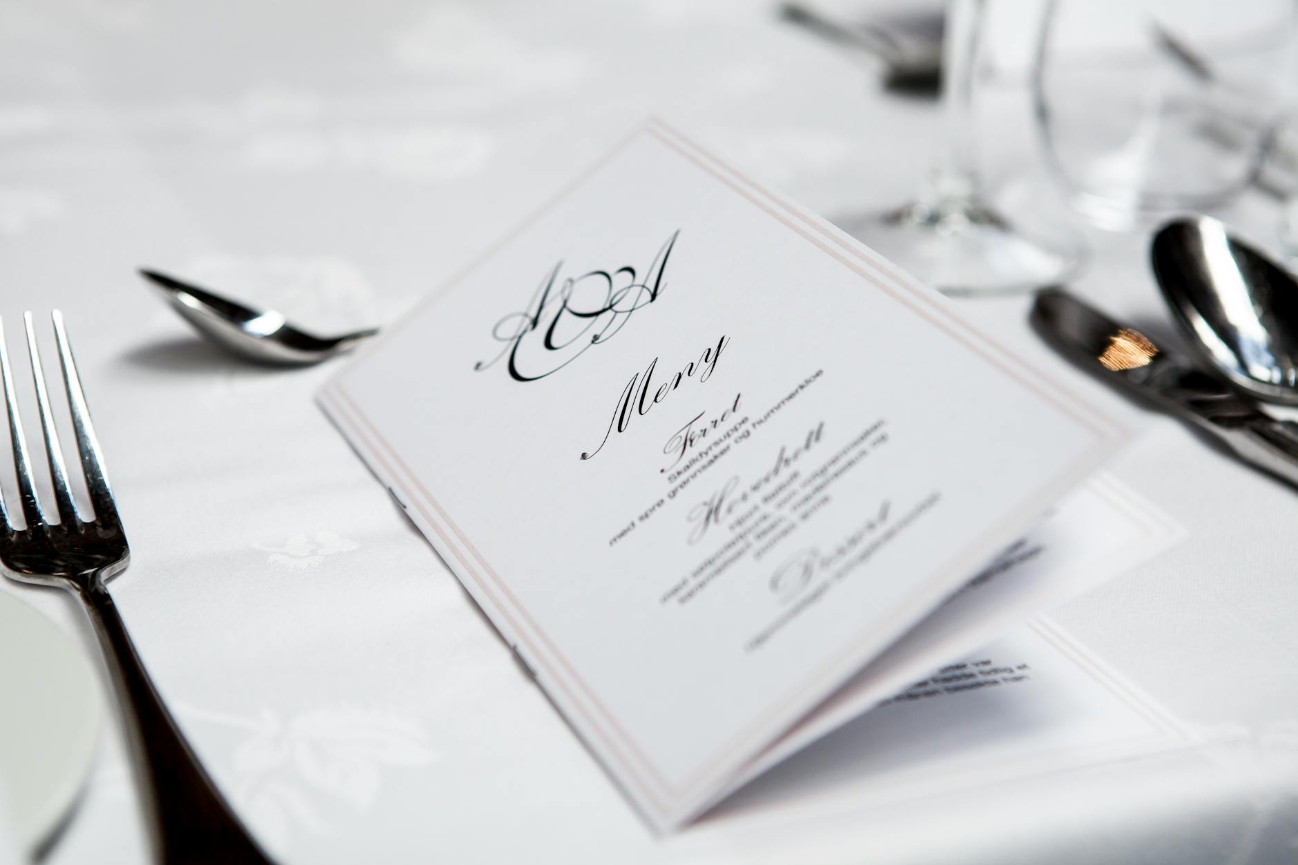
The Restaurant Menu Is Playing Mind Games With You — Here's How to Win
The Restaurant Menu Is Playing Mind Games With You — Here's How to Win
You sit down. The server hands you a menu. You feel like you're making a free choice.
You are not entirely making a free choice.
Behind that laminated card — or that artfully distressed leather booklet, or that single chalkboard on the wall — is an entire discipline called menu engineering, and its entire purpose is to make sure you order what the restaurant wants you to order, not necessarily what you actually want. The good news? Once you know how it works, the whole thing becomes surprisingly easy to navigate.
The Sweet Spot Your Eyes Always Go To First
Menu designers and restaurant consultants have spent decades studying where people's eyes land when they open a menu. The most widely cited finding is something called the "golden triangle" — when you open a two-page menu, your eyes tend to travel first to the center of the page, then to the top right corner, then to the top left corner. Those three zones are prime real estate, and restaurants know it.
High-margin items — the dishes that cost relatively little to make but carry a strong markup — get placed in those zones. The item your eyes hit first is rarely the best deal on the menu. It's the item the restaurant most wants to sell you.
Single-page menus and smaller, more curated menus (a trend that accelerated after the pandemic thinned out kitchen staff everywhere) actually work even more aggressively. With fewer items to scan, your attention gets funneled more deliberately. A short menu isn't always a sign of quality. Sometimes it's just a tighter funnel.
The Dollar Sign They Deliberately Removed
Look closely at a menu next time you're out. There's a decent chance you won't see a single dollar sign anywhere on it. That's not an accident or a design choice made for aesthetics — it's a documented psychological tactic.
Researchers at Cornell University's Center for Hospitality Research found that diners spend significantly more when prices are listed as plain numerals ("14") compared to prices listed with dollar signs ("$14") or prices written out in words ("fourteen dollars"). The dollar sign, it turns out, triggers a mental association with spending and loss. Remove it, and the number starts to feel more abstract — less like money leaving your wallet, more like a score in a game you're winning.
Some higher-end restaurants take it further by writing prices in a smaller font than the dish description, burying the number at the end of a long, evocative paragraph about heritage grain and hand-foraged mushrooms. By the time you've read all that, you've already decided you want it.
Anchoring: Why the Expensive Item Exists
Have you ever noticed a single jaw-dropping item on a menu — a $95 wagyu steak or a $60 whole roasted fish for two — that seems wildly out of place with everything else? That item is almost certainly an anchor.
Restaurants strategically place ultra-premium items on menus not necessarily because they expect to sell many of them, but because their presence makes everything else look reasonably priced by comparison. After your eyes land on the $95 steak, the $38 pork chop suddenly seems almost sensible. The $24 pasta looks like a bargain. Your perception of "expensive" has been recalibrated upward, and you'll likely spend more than you would have if the anchor item didn't exist.
This is menu engineering borrowing directly from retail pricing psychology, and it works remarkably well.
The Box, the Bold, and the Beautiful
Notice any items on the menu surrounded by a box, printed in a different font, or accompanied by a small photo? Those treatments cost the restaurant money — either in design fees or in printing — and they don't spend that money on dishes they're not trying to push.
Boxed or visually highlighted items are almost always either high-margin dishes the kitchen wants to move, or items tied to a promotional deal. Photos have a particularly strong effect: studies consistently show that including a photo of a dish increases its order rate significantly, which is why budget-friendly chains load their menus with images while upscale restaurants avoid them entirely (photos feel too promotional for a certain kind of dining room, but the psychology still applies — they just use evocative language instead).
How to Actually Order What You Want
None of this means you're helpless. Knowing the tricks is most of the battle. A few practical moves:
Scan the whole menu before anything catches your eye. Resist the pull of the first item that jumps out. Give yourself a full pass through before forming preferences.
Look at the middle and lower sections of each column. High-margin items cluster at the top and in highlighted zones. The genuinely interesting, sometimes better-value dishes often live in quieter parts of the page.
Ask your server what they'd order. This sounds obvious, but servers eat there. They know what's actually good versus what the restaurant is pushing tonight.
Be skeptical of anything in a box. Not because it's bad — it might be excellent — but because you should be choosing it on your own terms, not because a rectangle told you to.
The menu is a conversation the restaurant is having with your subconscious. Now that you know the language, you can finally talk back.
Order what you actually want. The house has enough advantages already.